
Telco Consumer Self-Service App
A User-Centric Mobile Application

Context and Background
The Telco Consumer App is a mobile application designed for customers to self-service their needs. Launched in 2014 and currently operational in 16 countries, the app boasted over 9,800,000 users at the time. In 2018, the primary theme was to enhance user adoption and engagement.
My Role
As the UX lead, I was entrusted with a pivotal role in this project. My responsibilities encompassed orchestrating research teams across five countries - South Africa, Uganda, Ivory Coast, Nigeria, and Cameroon- to formulate a scalable UX blueprint and design solution. The project was successfully concluded in December 2018, with the final solution being rolled out across the continent in 2019.
Project Goals
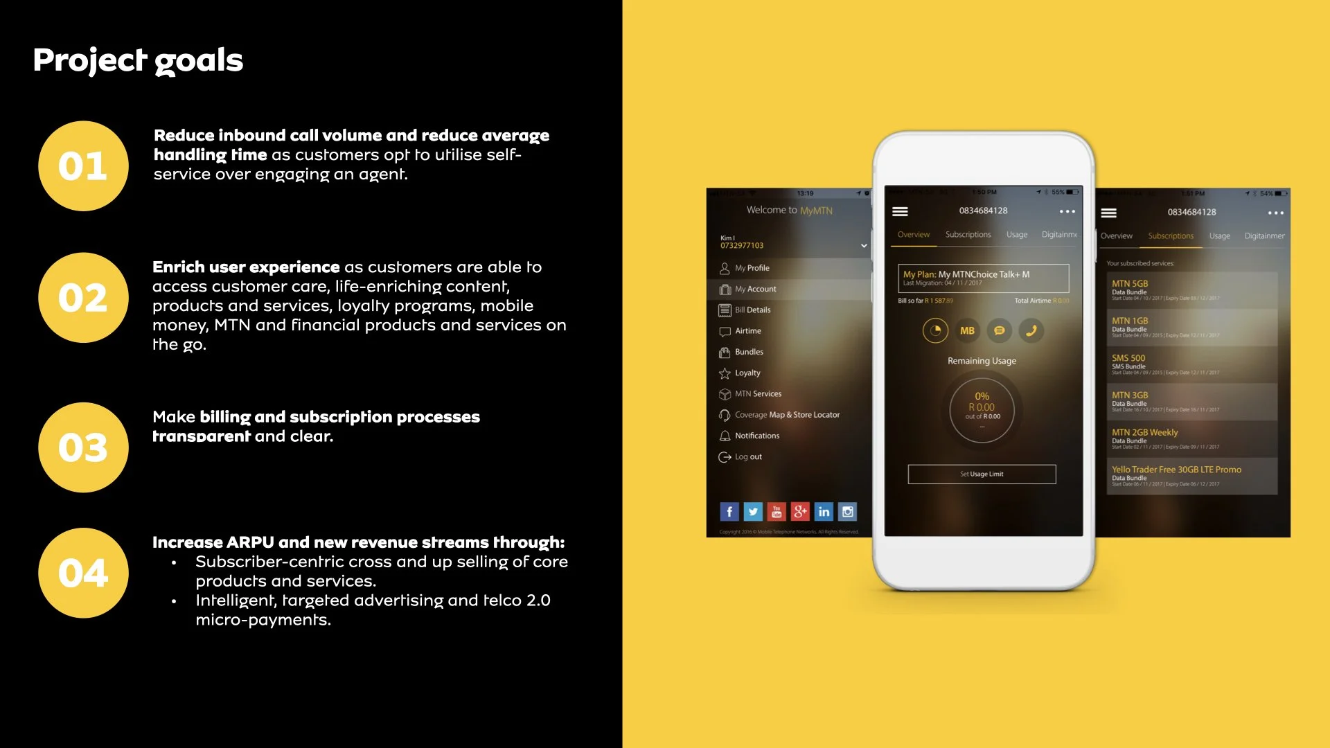
Reduce inbound call volume and average handling time as customers opt for self-service.
Enhance user experience, allowing customers to access customer care, life-enriching content, products, services, and loyalty programs on the go.
Simplify billing and subscription processes for transparency.
Increase Average Revenue Per User (ARPU) and generate new revenue streams through cross-selling, targeted advertising, and micro-payments.
Usability Objectives
Detailed navigation and task performance assessment regarding presentation, content, and interaction.
Test the product concept and information architecture with the target audience to ensure resonance with their mental model and needs.
Identify friction points and confusing experiences to optimize the design for intuitiveness and seamlessness.
Identify and resolve unforeseen issues, bugs, and oversights.
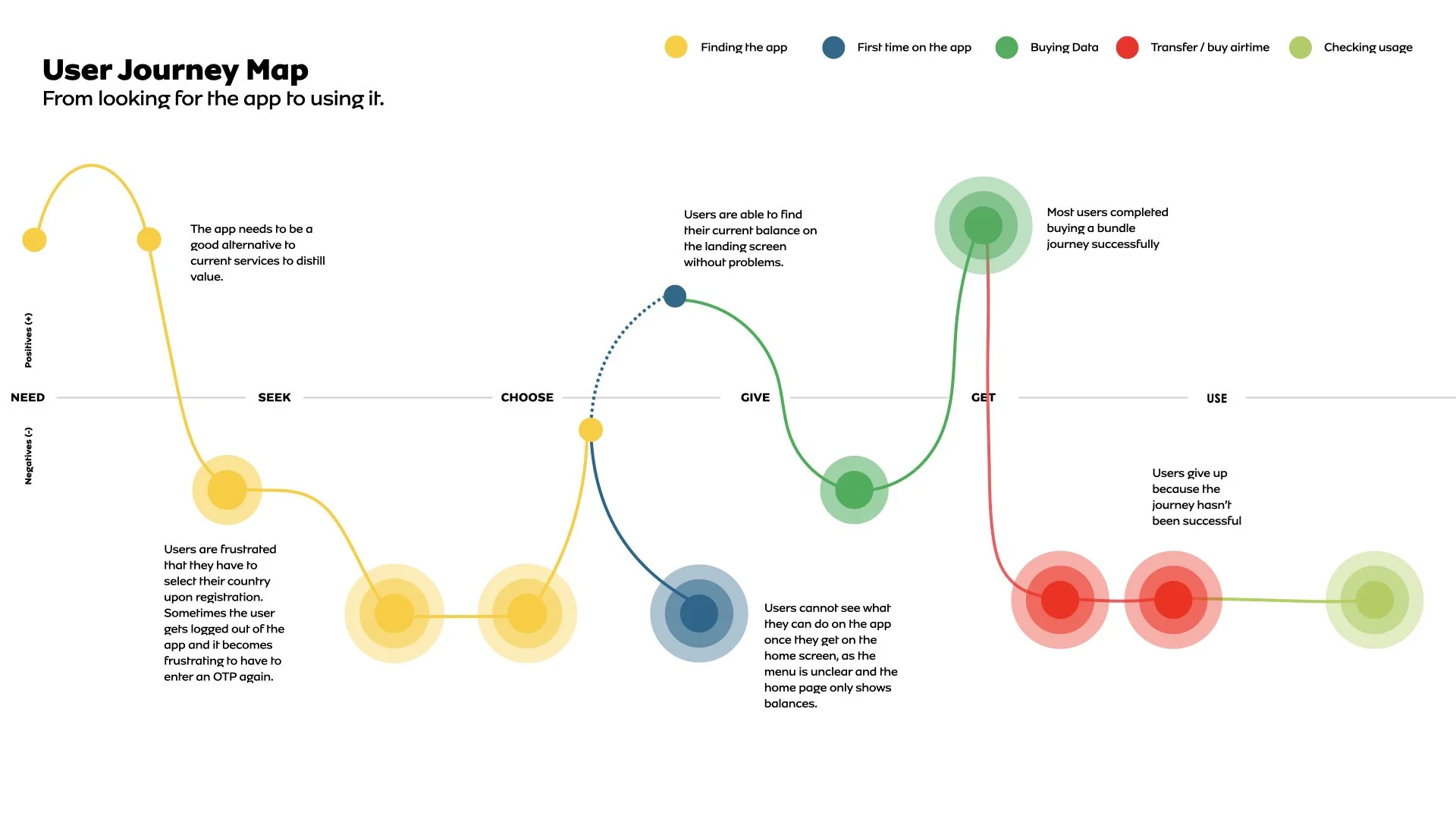
How We Uncovered Business Challenges
We conducted business workshops with stakeholders, including key players in each operating country (Nigeria, South Africa, and Uganda), group product owners, and partner teams.
The Four Key Challenges
Outdated visual design and counterintuitive layout.
Limited understanding of users' needs, resulting in an app of little value in their lives.
Lack of personalized and unique experiences compared to competitors.
Insufficient self-service functionality, such as unsubscribing from a WASP.
User Research and The Design Process
To tackle these challenges, we embarked on a journey through user research, unfolding layers of pain points and usability issues. Our exploration encompassed surveys, interviews, usability tests, prototype evaluations, content assessments, and expert reviews. Drawing from these insights, we meticulously crafted user personas, aligning them with evolving user needs, app-related job-to-be-done, and various tasks, ultimately shaping the progressive design solution. This process of understanding and refinement was driven by our design principles, each marking a distinct phase in our journey.
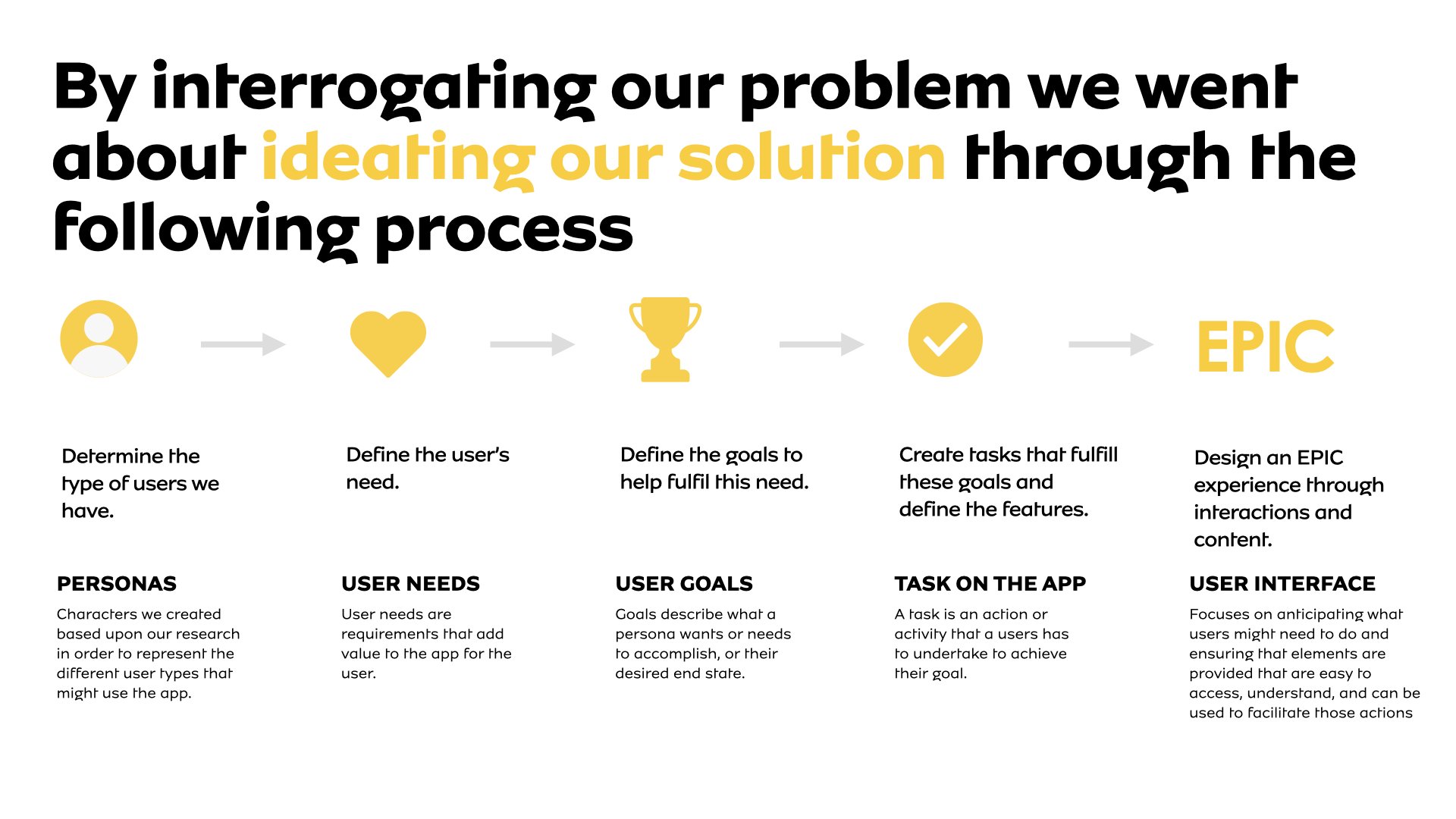
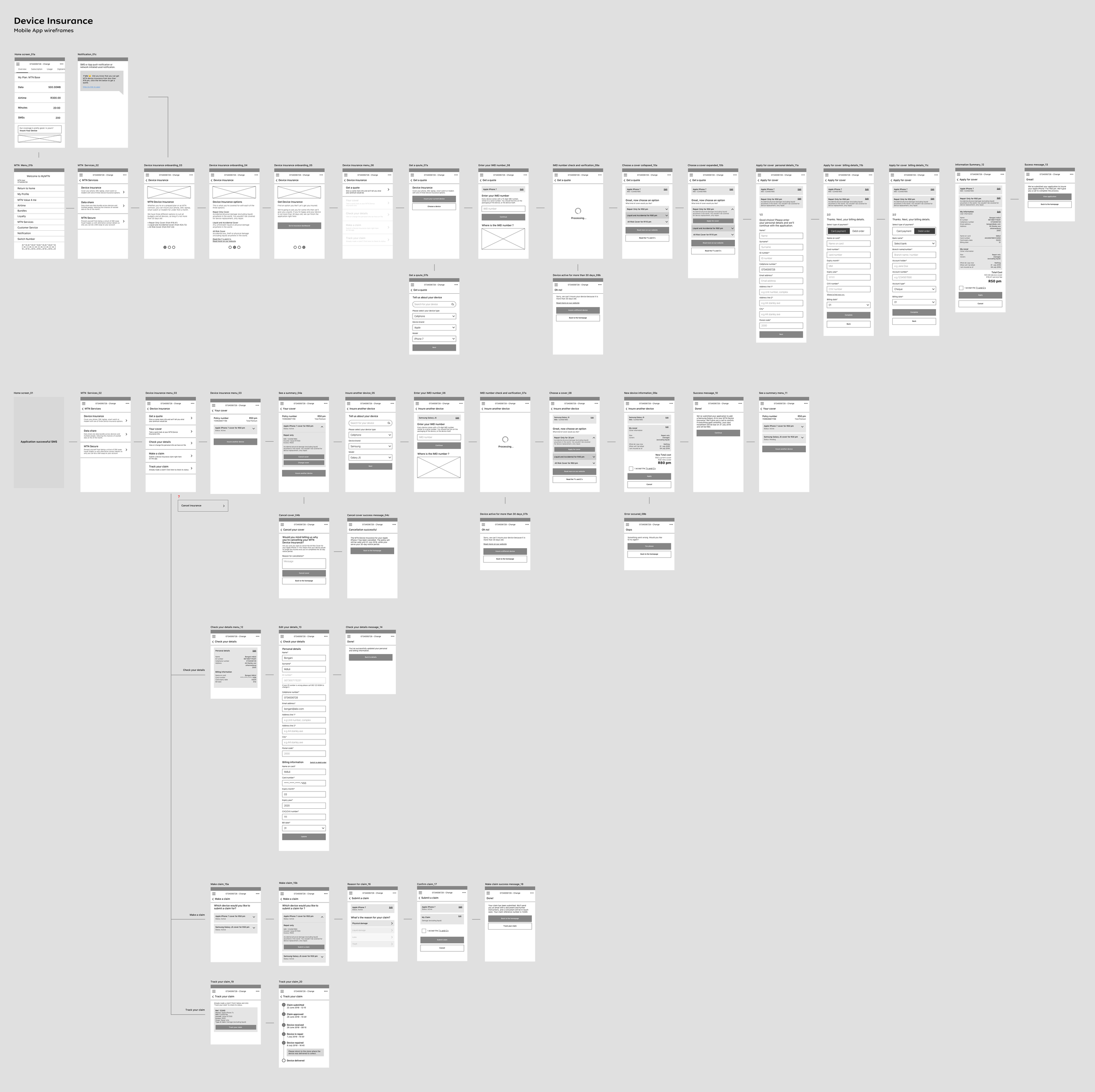
We used an iterative process working up in fidelity from wireframes to a prototype, testing with users at every phase to validate our assumptions.

Solution
We carefully cultivated a sequence of design principles throughout our design journey, each evolving as we advanced in our project. These principles were instrumental in guiding our approach and shaping the interaction design pattern, underlining the concept of time and progression:
We carefully cultivated a sequence of design principles throughout our design journey, each evolving as we advanced in our project. These principles were instrumental in guiding our approach and shaping the interaction design pattern, underlining the concept of time and progression:

Efficiency Through Speed and Simplicity: In the initial stages, we prioritized the development of an interface that excelled in speed, cleanliness, and minimal user effort. This foundation set the pace for our entire design journey.
Recognizing Individuality: As we delved deeper into our work, we transitioned to recognizing and celebrating the uniqueness of each user. This personalization enhanced the interface and made it more attuned to individual needs.
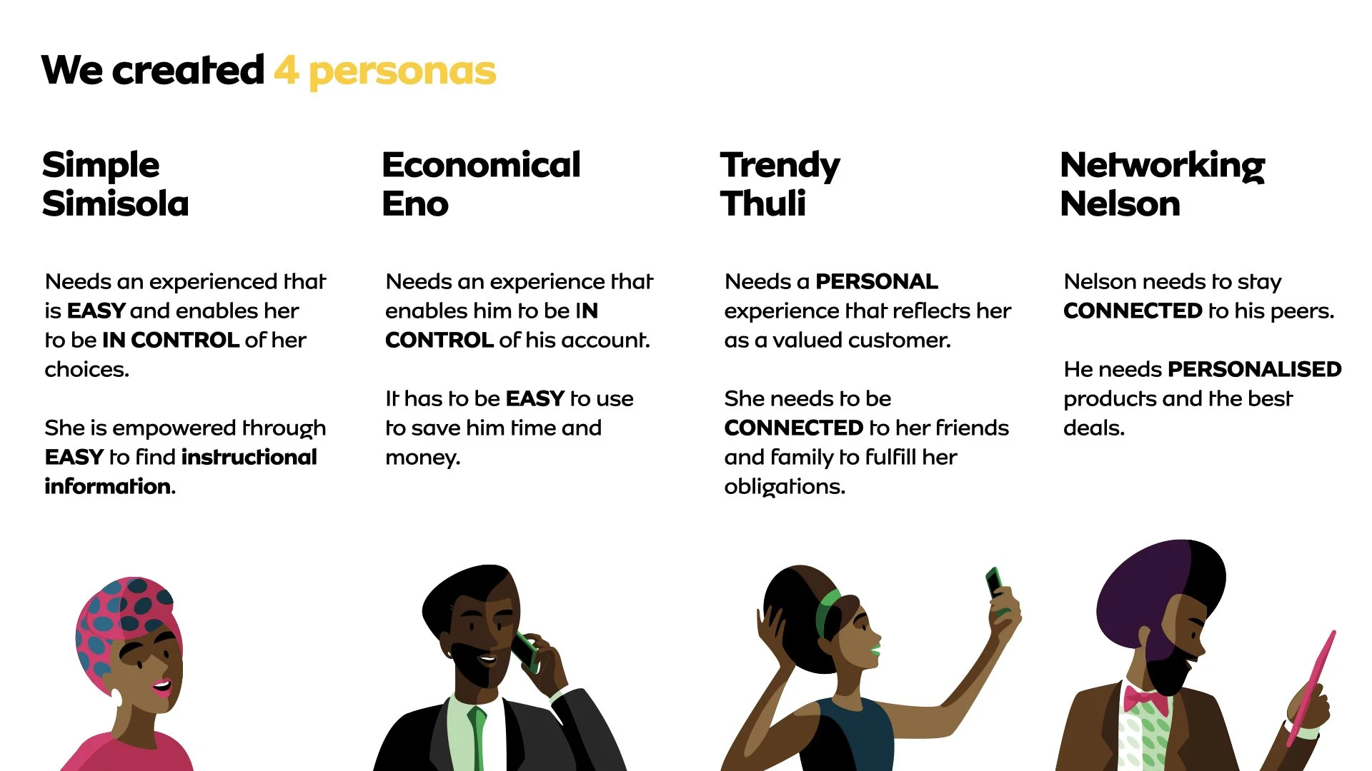
Informed Decision-Making: The subsequent phase provided users with all the information required to make well-informed decisions and execute actions seamlessly. Time became a critical factor as users could now swiftly access essential details.
Holistic User Experience: Our design approach ultimately extended beyond the boundaries of the app, considering the user's experience both within and outside the application. This holistic perspective added an extra dimension to the user's interaction with the app, emphasizing the progression of time in their journey.

In this framework, the concept of time was instrumental in illustrating the evolution of our design principles and their impact on the interaction design pattern and user interface.
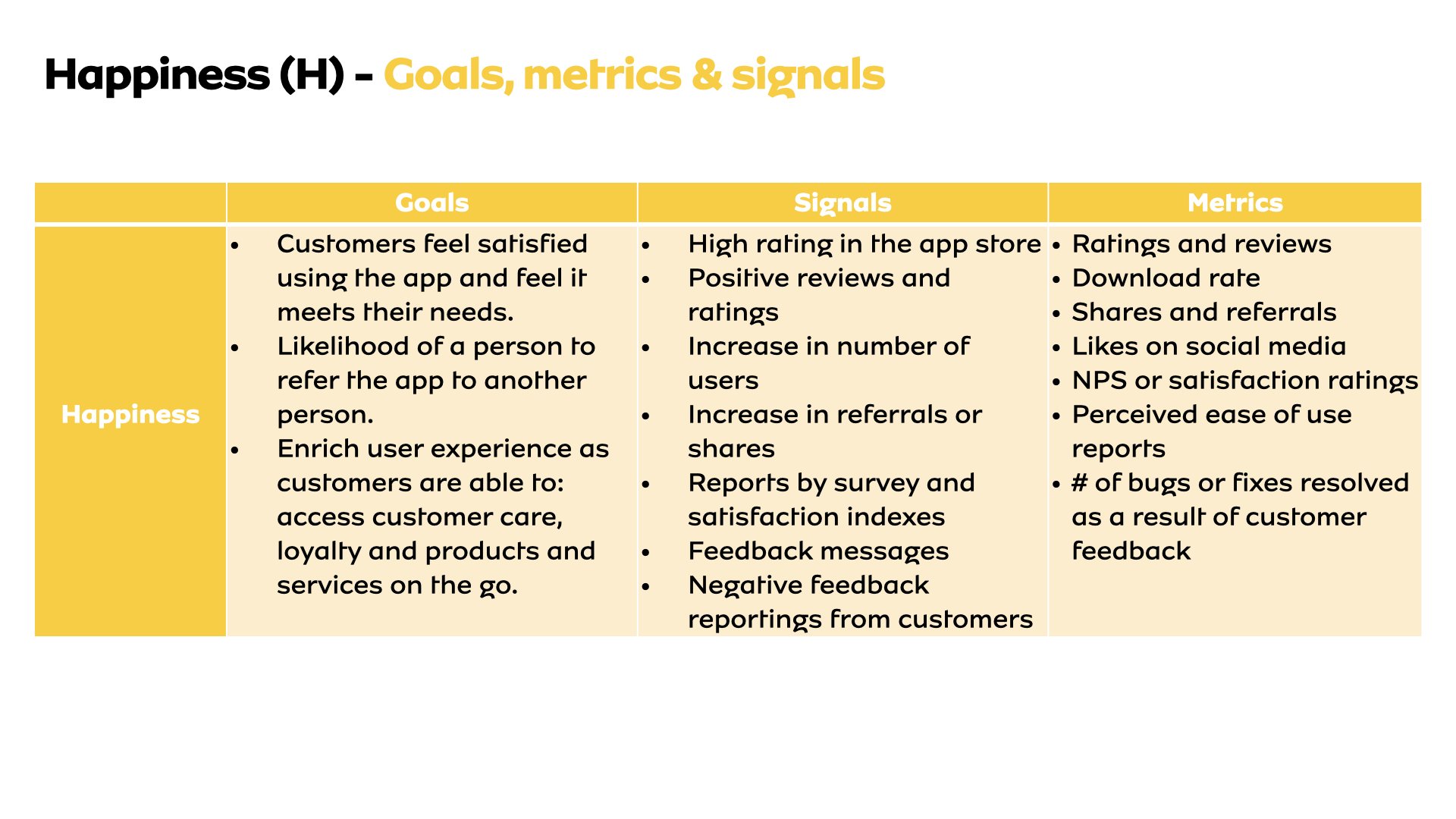
Adapting Google's HEART Framework for Defining Metrics
To improve user experience, we adopted Google's HEART framework to define and measure metrics. This framework allowed us to evaluate user happiness and the overall effectiveness of the redesigned app.
Impact and Overall Performance
The redesign resulted in significant improvements:

55%
Faster login and home page loading.
80%
Quicker airtime or data purchases in South Africa.
100%
Improvement in success and confirmation screen comprehension in Nigeria and South Africa.
25%
Faster location and viewing of usage balance summary and detail in South Africa.
60%
Faster airtime or data transfers in South Africa.
30%
Faster transfers in Nigeria.
The project showcases how a user-centred design approach, rigorous research, and iterative design can lead to substantial enhancements in user experience, addressing business challenges and yielding significant improvements in app performance and user satisfaction.